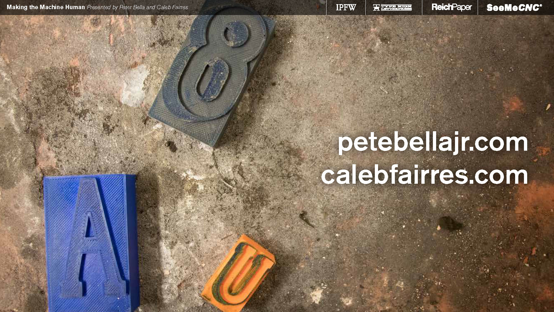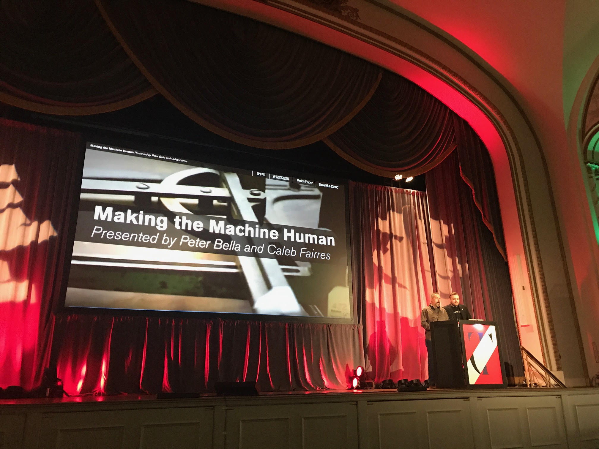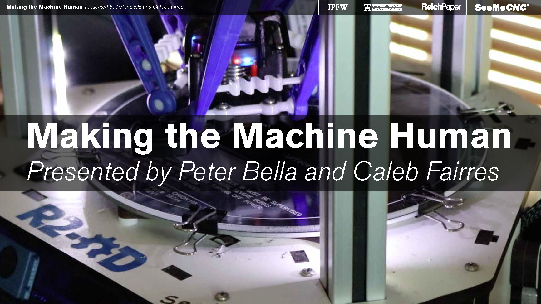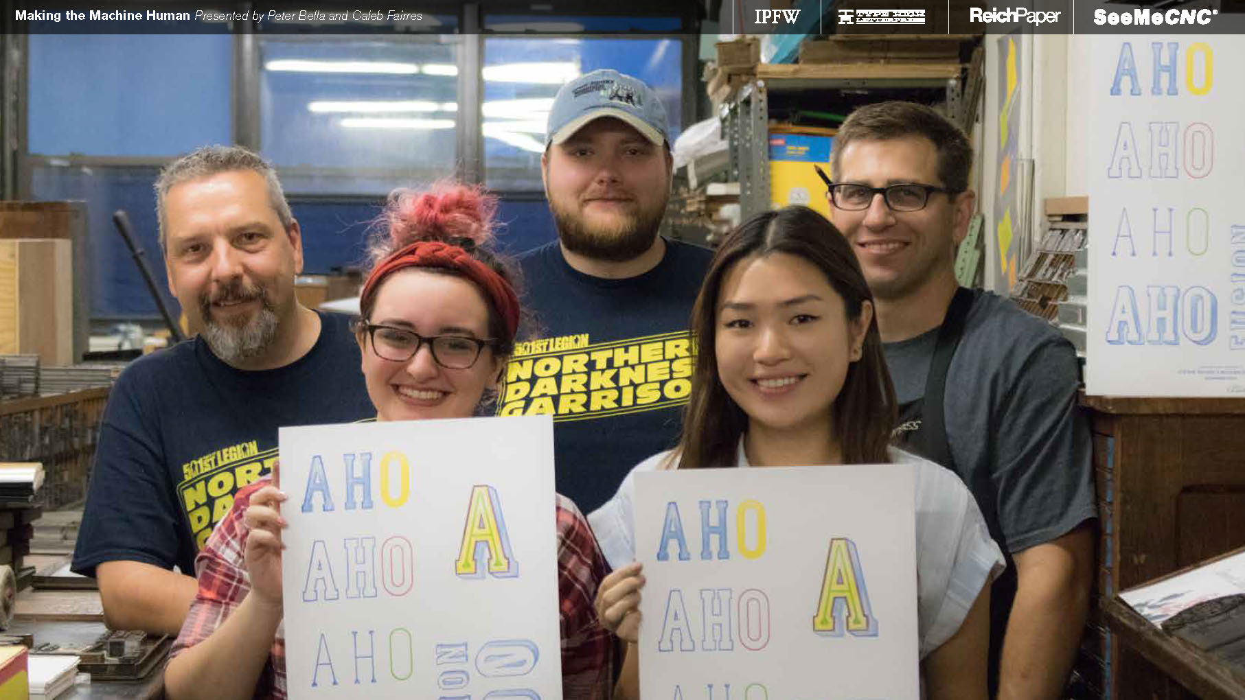
Look at those strapping handsome lads.

We had the amazing opportunity to present this project in the main conferece of TypeCon2017 in Boston, MA. Videos of this will be up shortly.

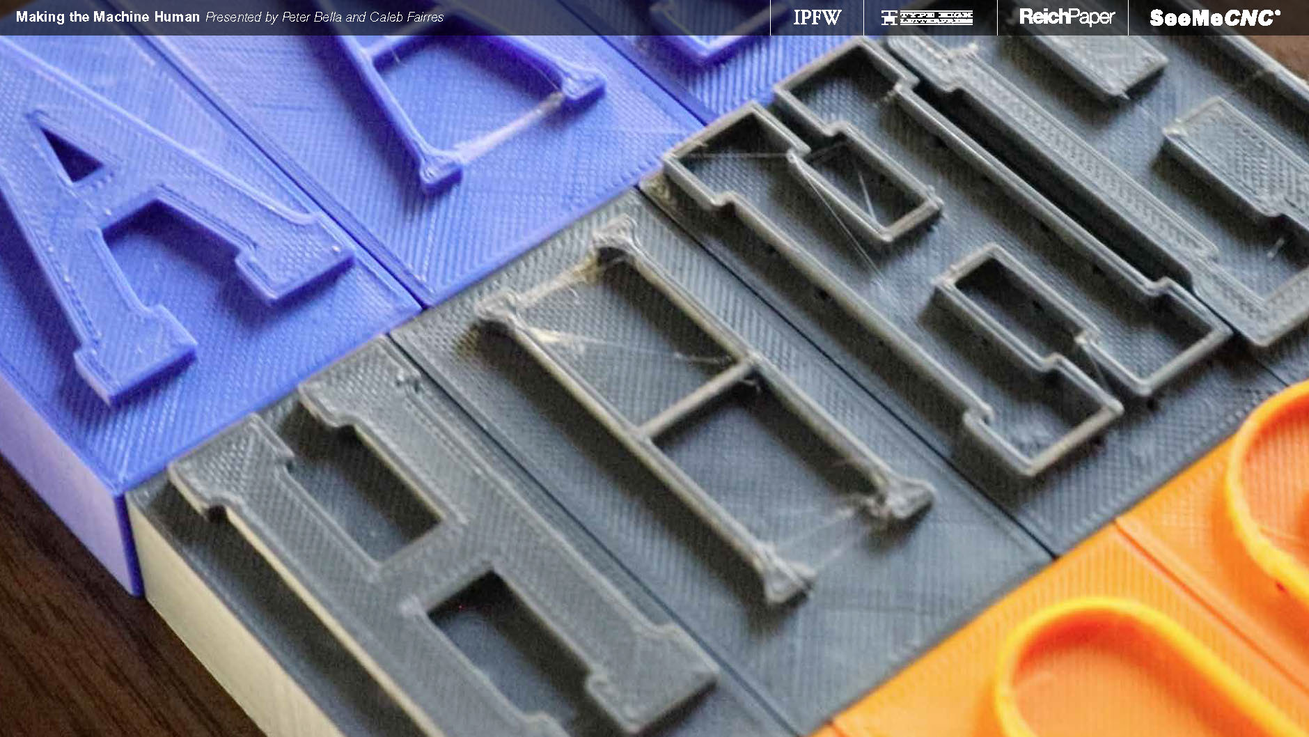
The idea was to blend old printing technologies with new printing technologies, and keep things as affordable as possible so people could build off our idea moving forward.

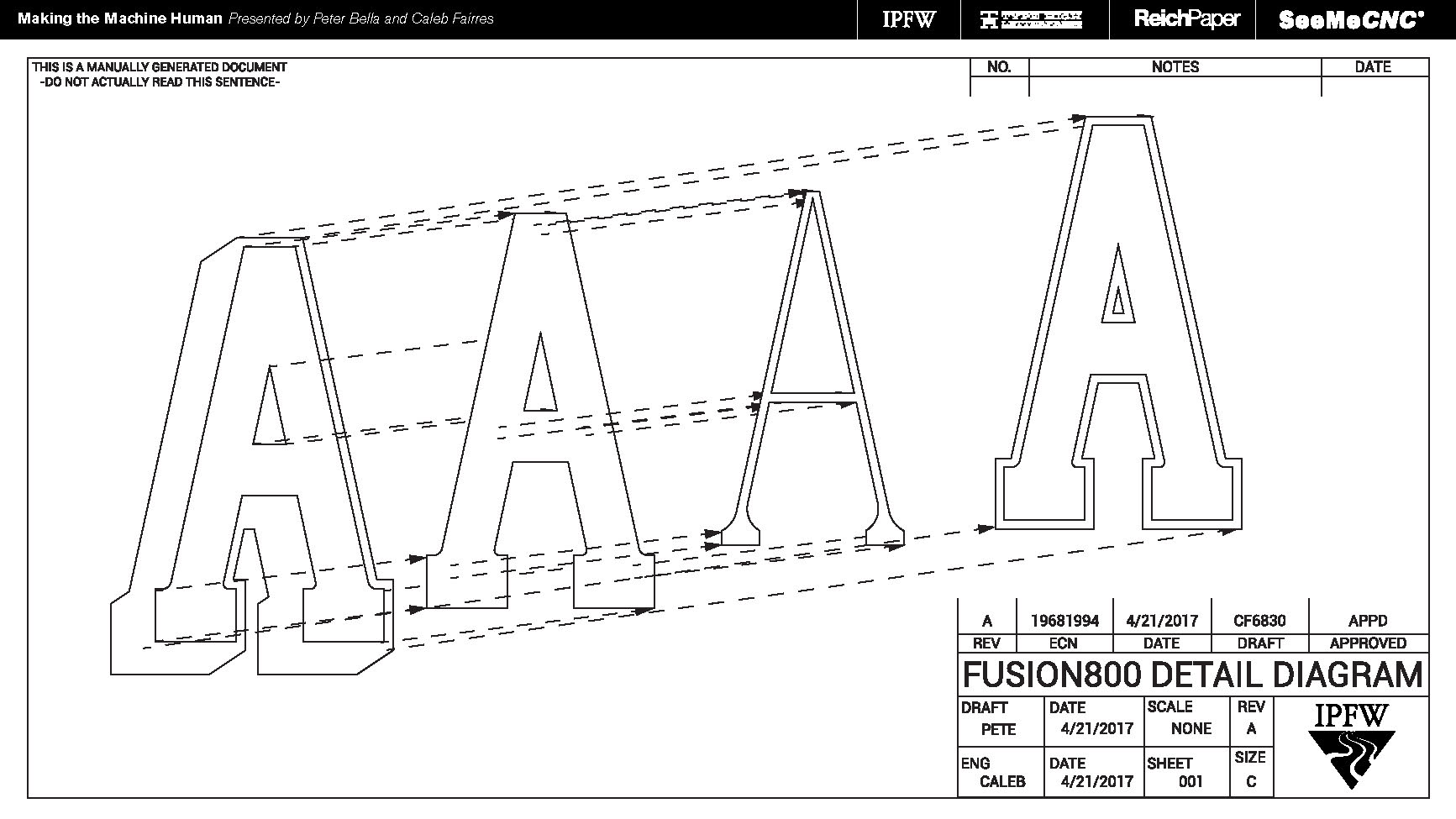
"Mechanical diagram" of the typeface fonts, just for fun.

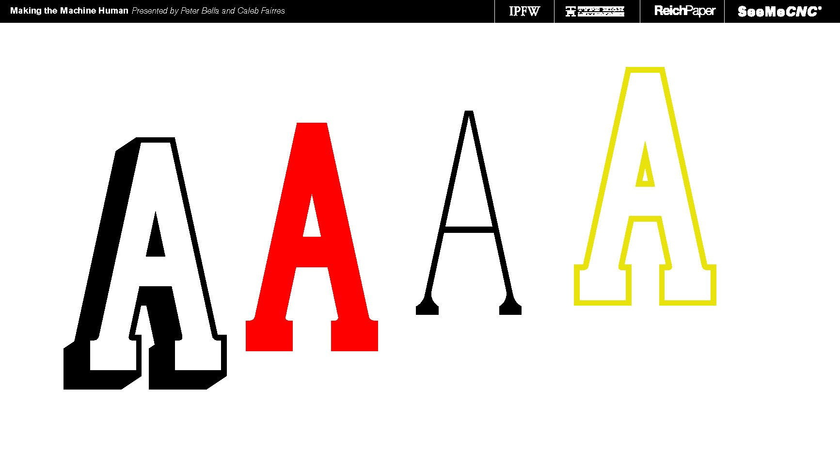
Fusion800 without the extra bits.

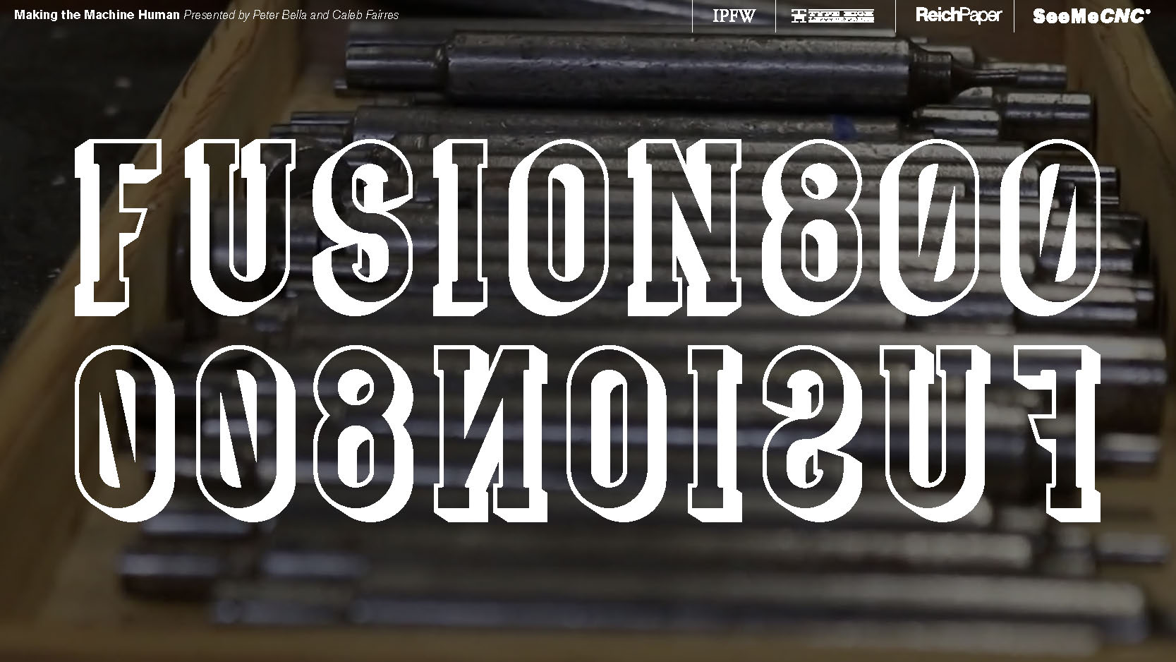
The name Fusion800 comes from a few different sources. ONE: It's the fusing of old and new technologies. TWO: the 3D printing process we used is called FDM (Fused Disposition Modelling) as it fuses layers of plastic together. THREE: Our goal was to see what humanistic qualities the machine could have. Making the machine human, like the Terminator. the 800 in Fusion800 is referencing the T-800 Terminator that promised us it would be back...

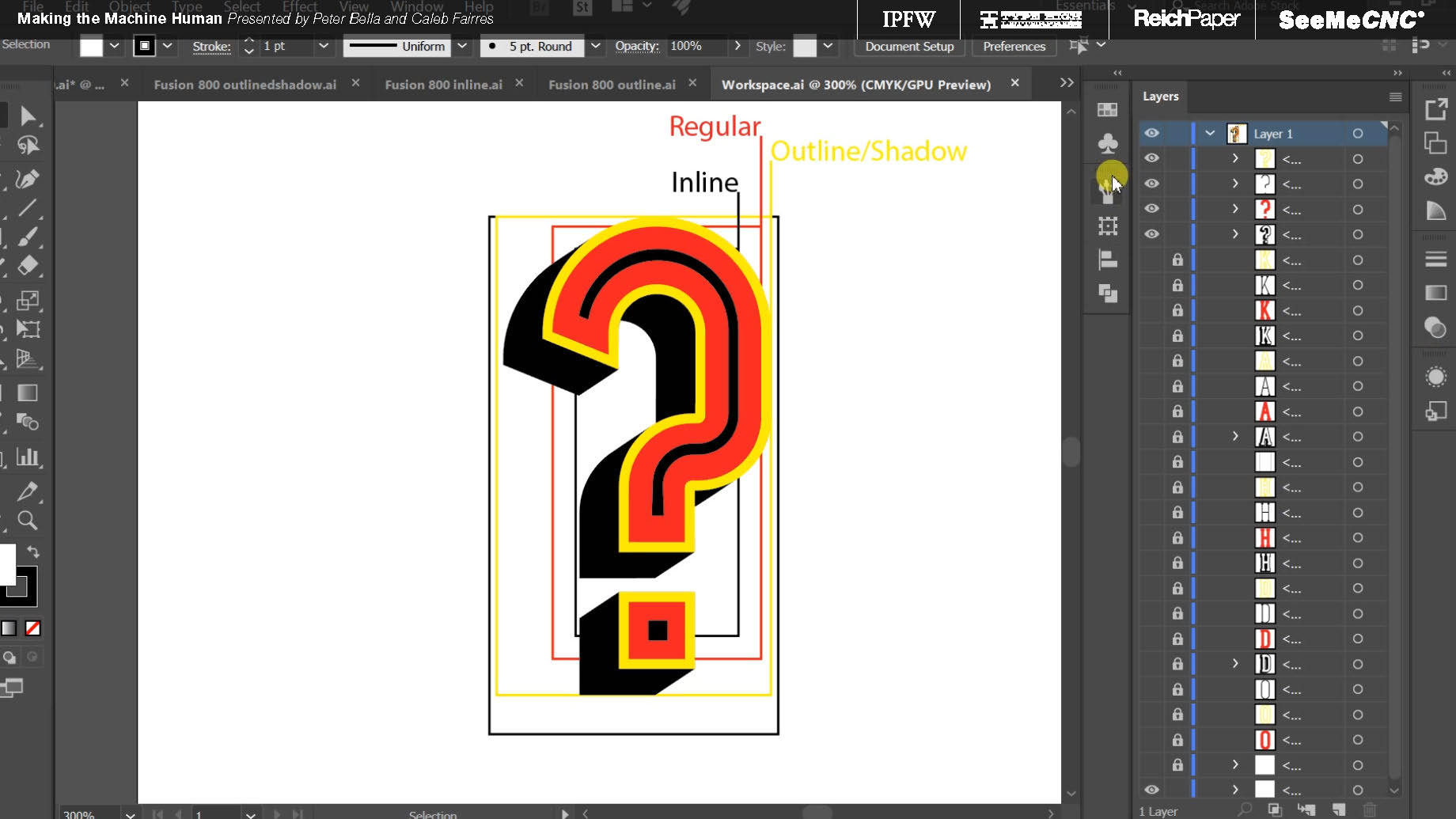
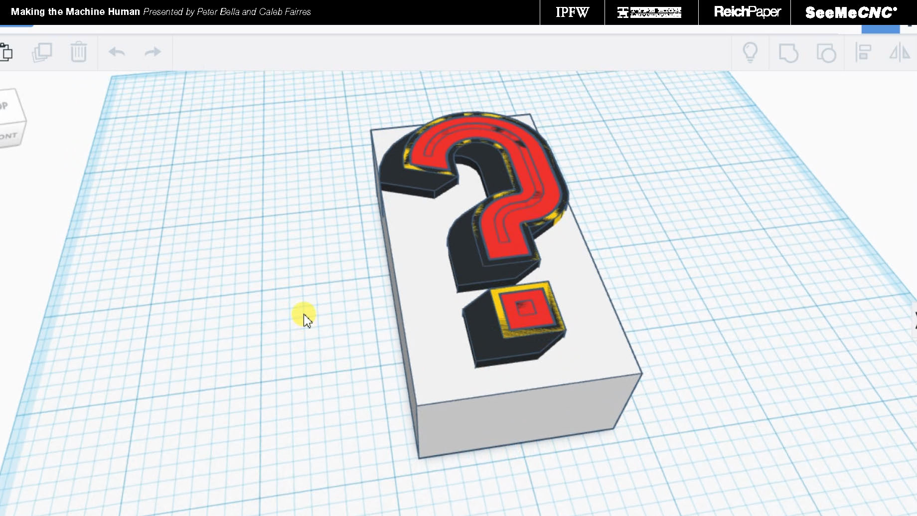
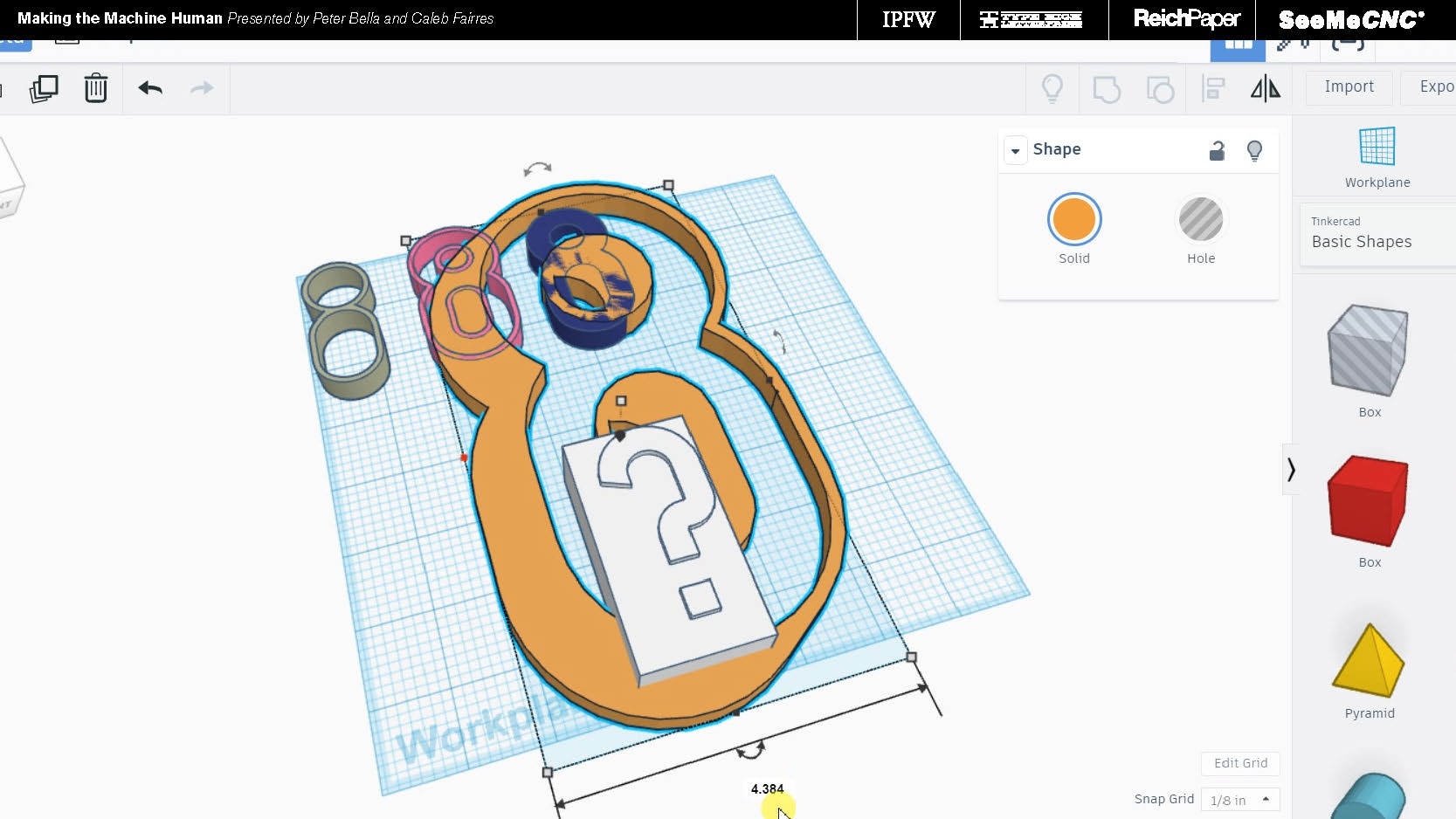
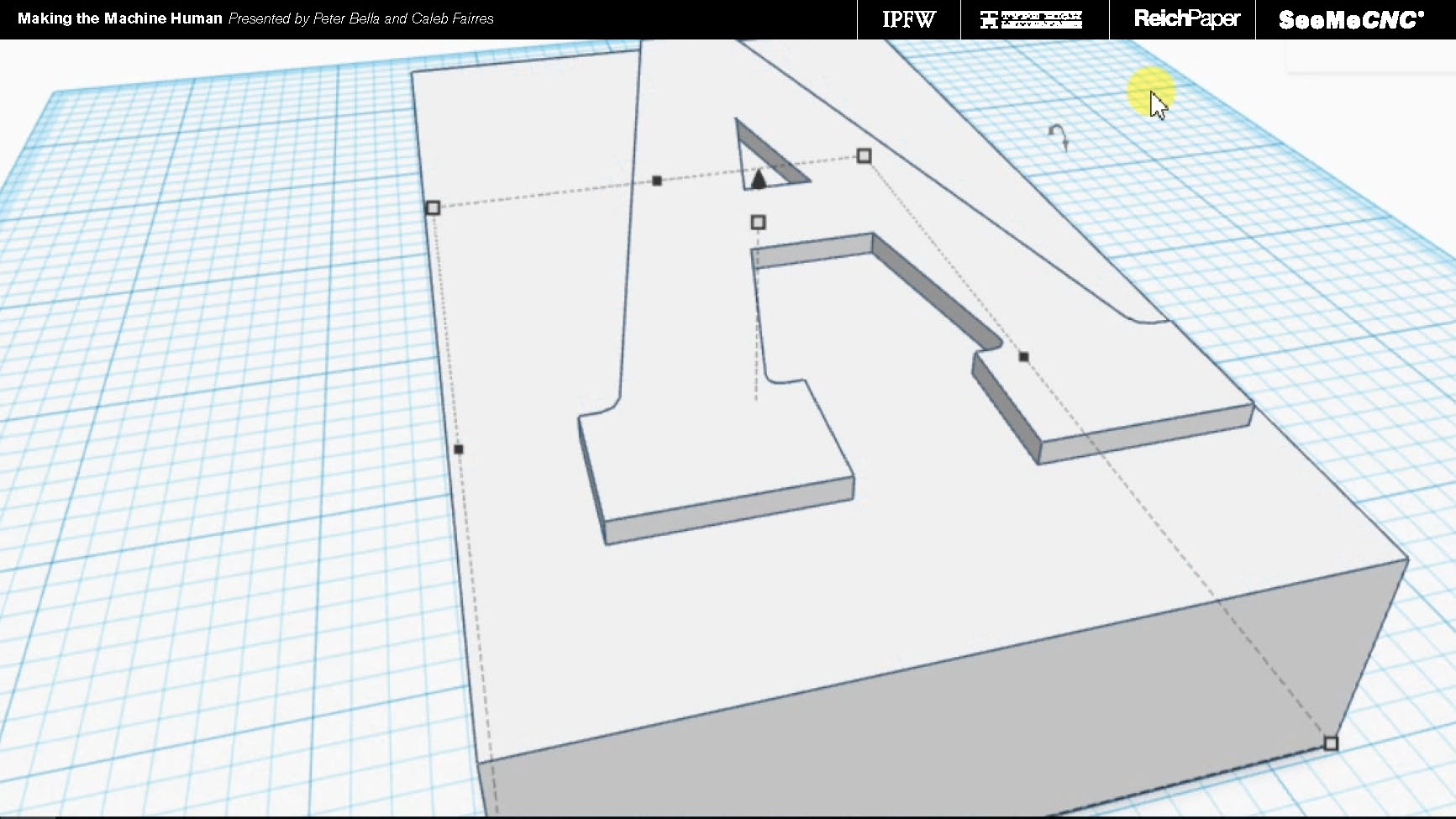
Bounding boxes were made to easily scale the type to proper point sizes, and accurately scale the various fonts of each letter accordingly.

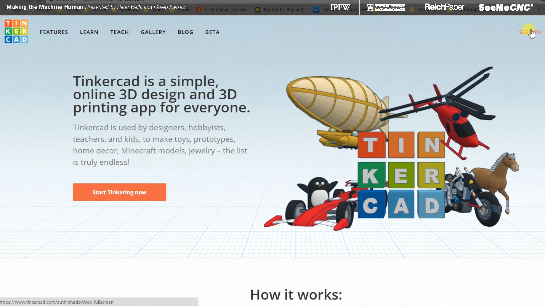
TinkerCAD was used, again, to keep things affordable and easily accessible to anyone who wants to build off what we've done.


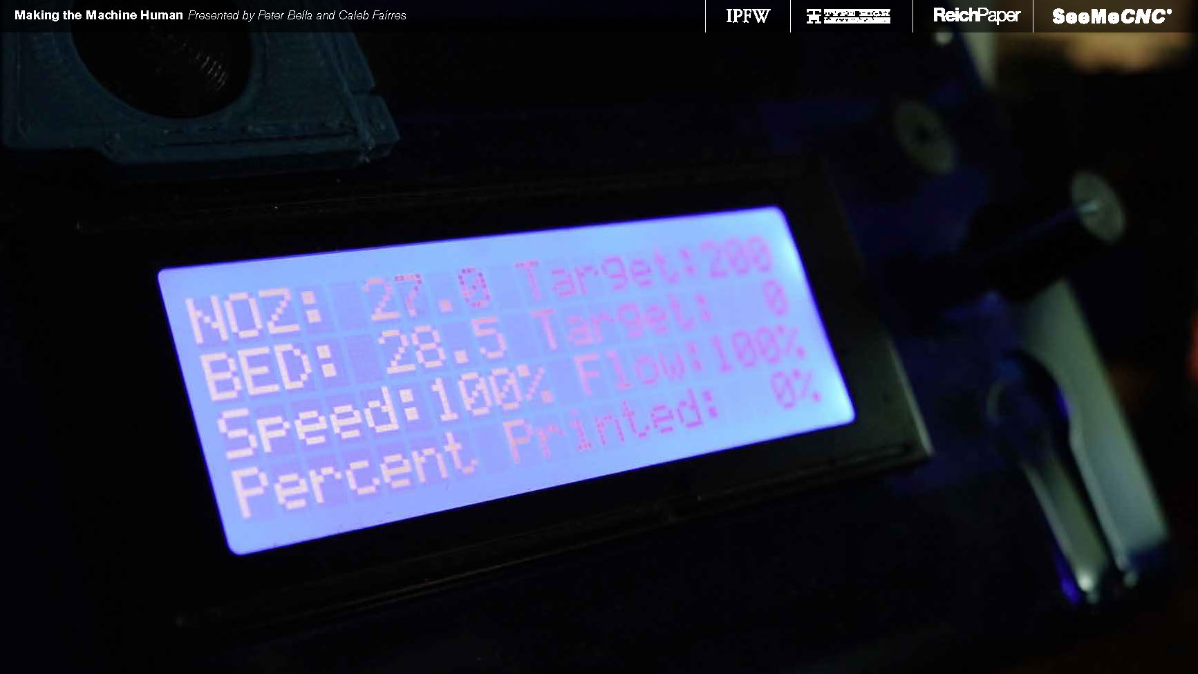
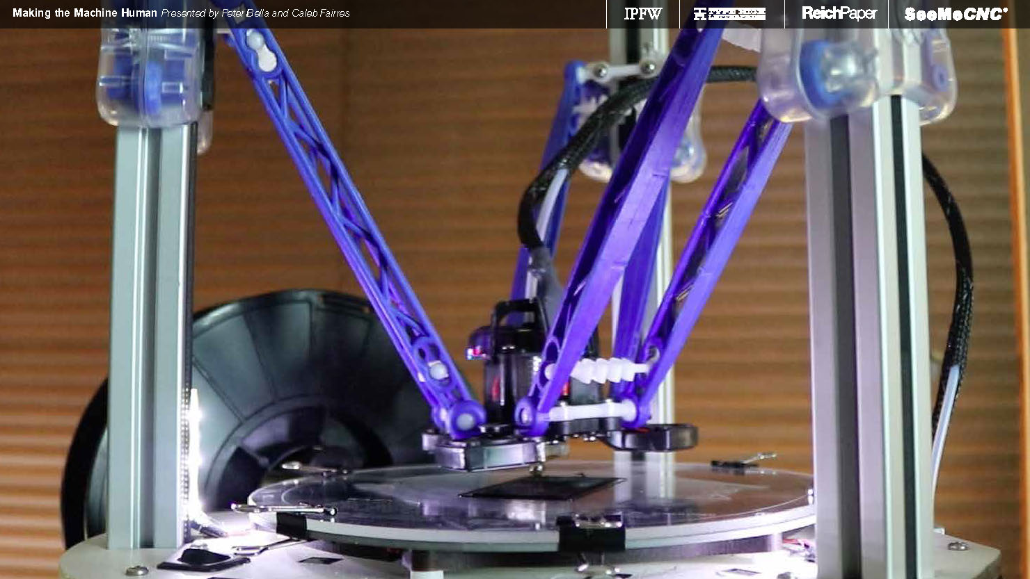
Keeping with the theme of affordability, machines from SeeMeCNC were used that were in the $500 range. You could easily imagine a 3D printer like that being in your home or office.

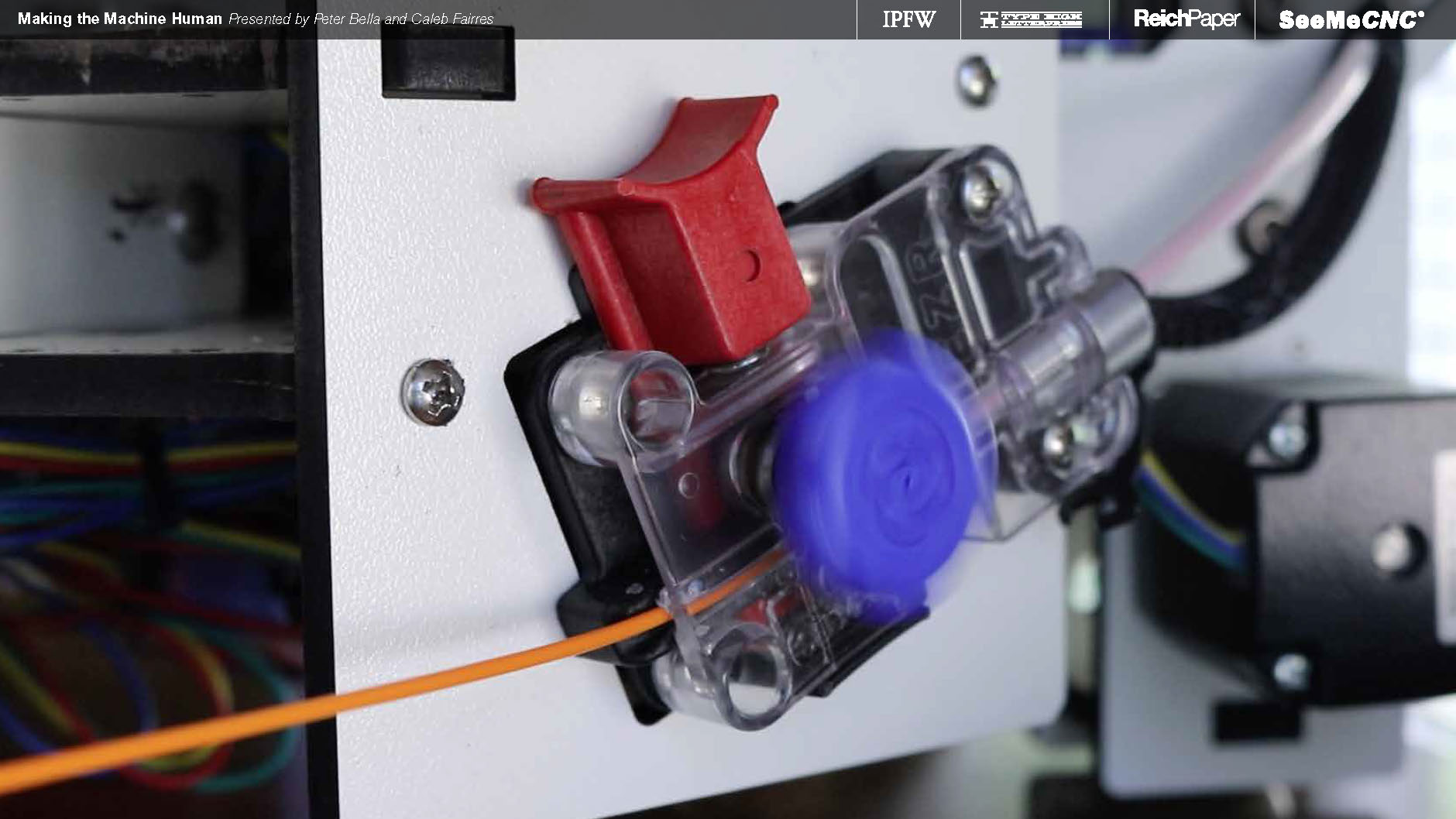
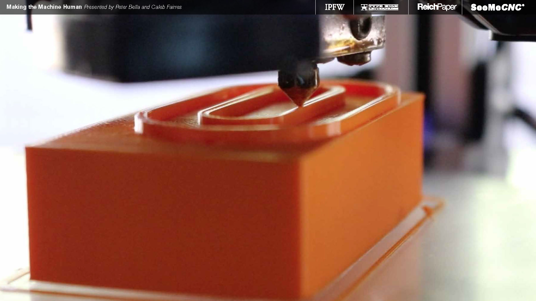
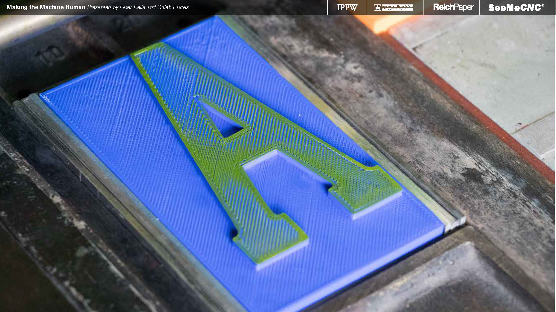
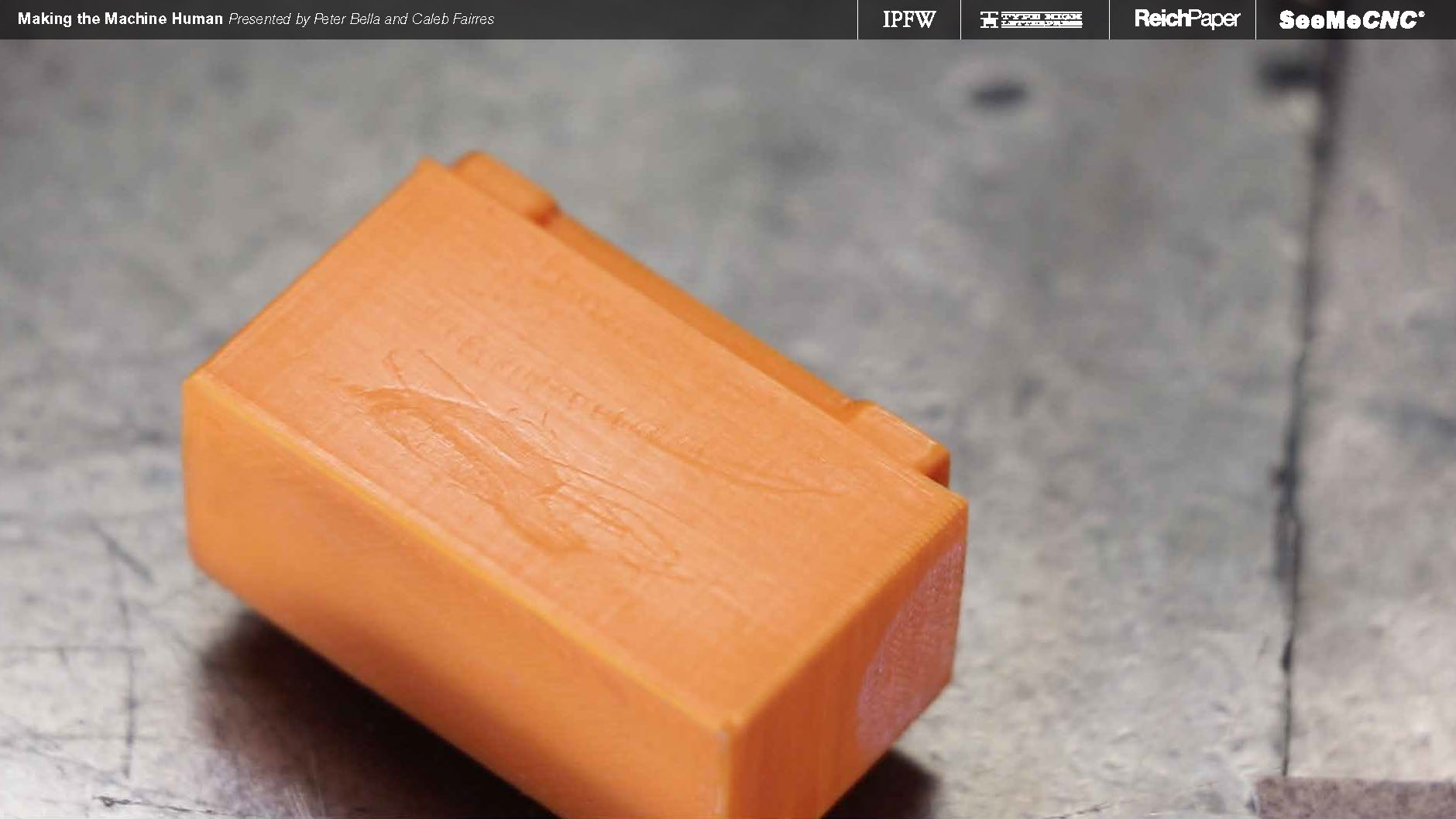
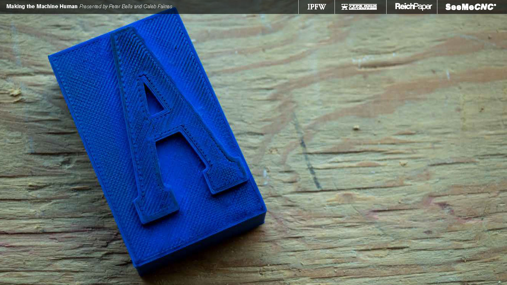
PLA filament was used, again for affordability and accessibility. I used Atomic brand filaments, as that brand is the best quality I've ever pushed through my printer.


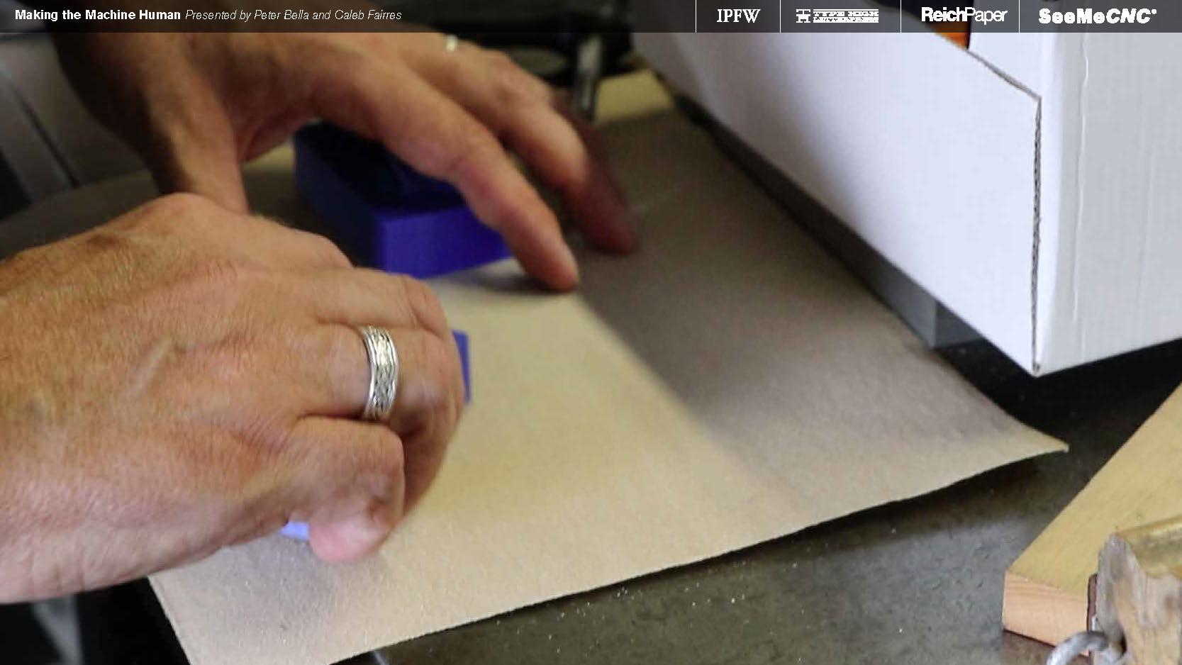
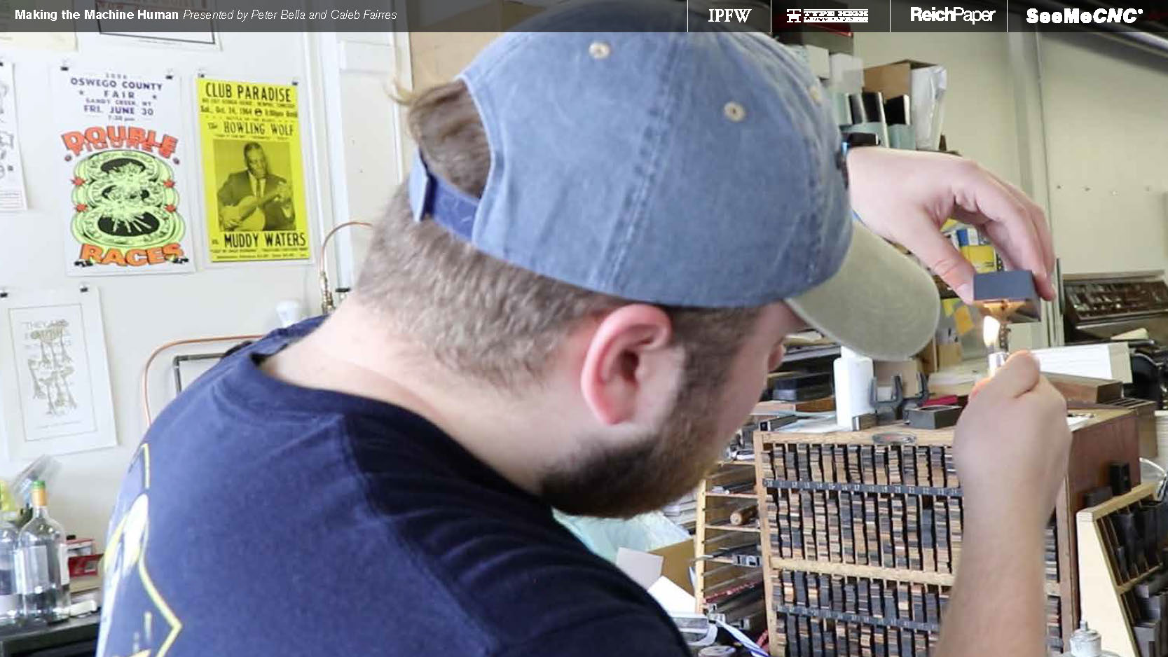
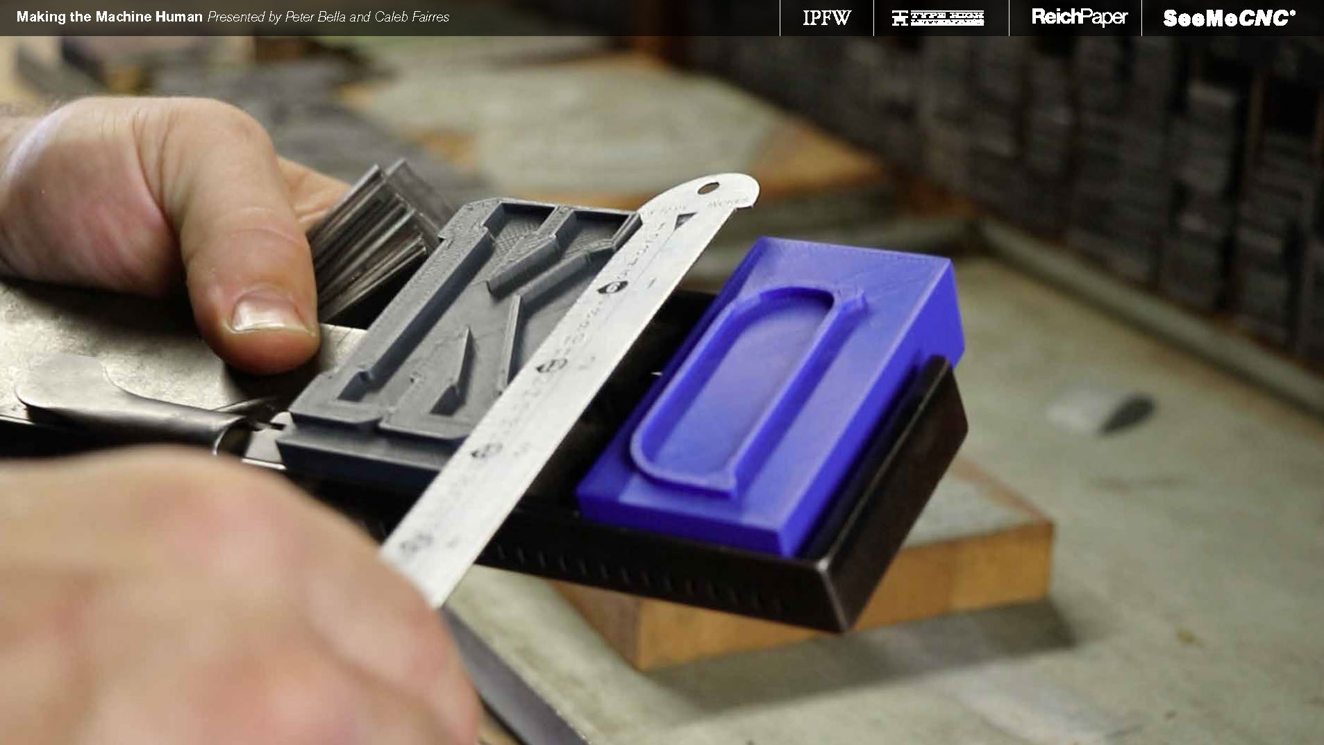
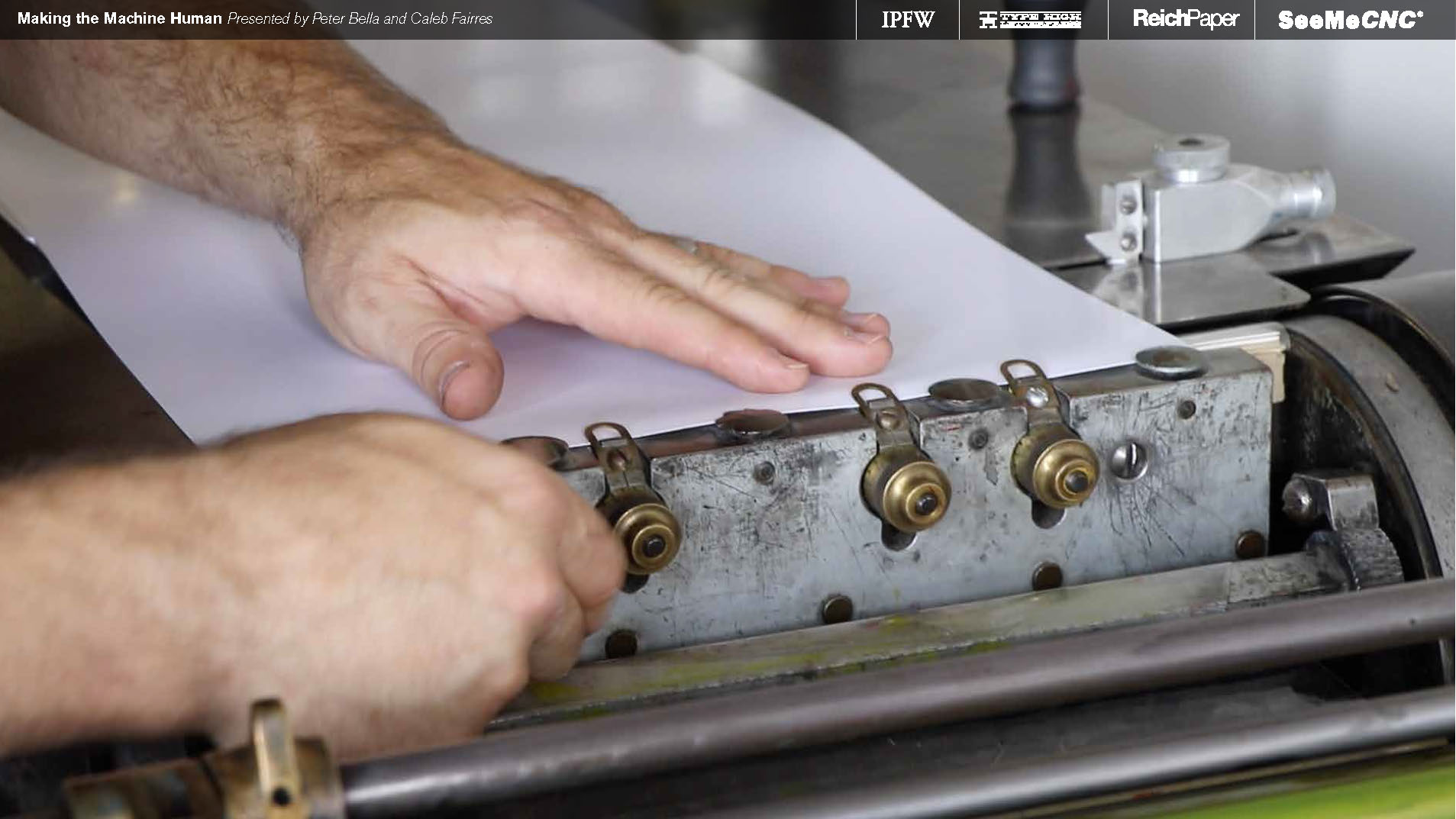
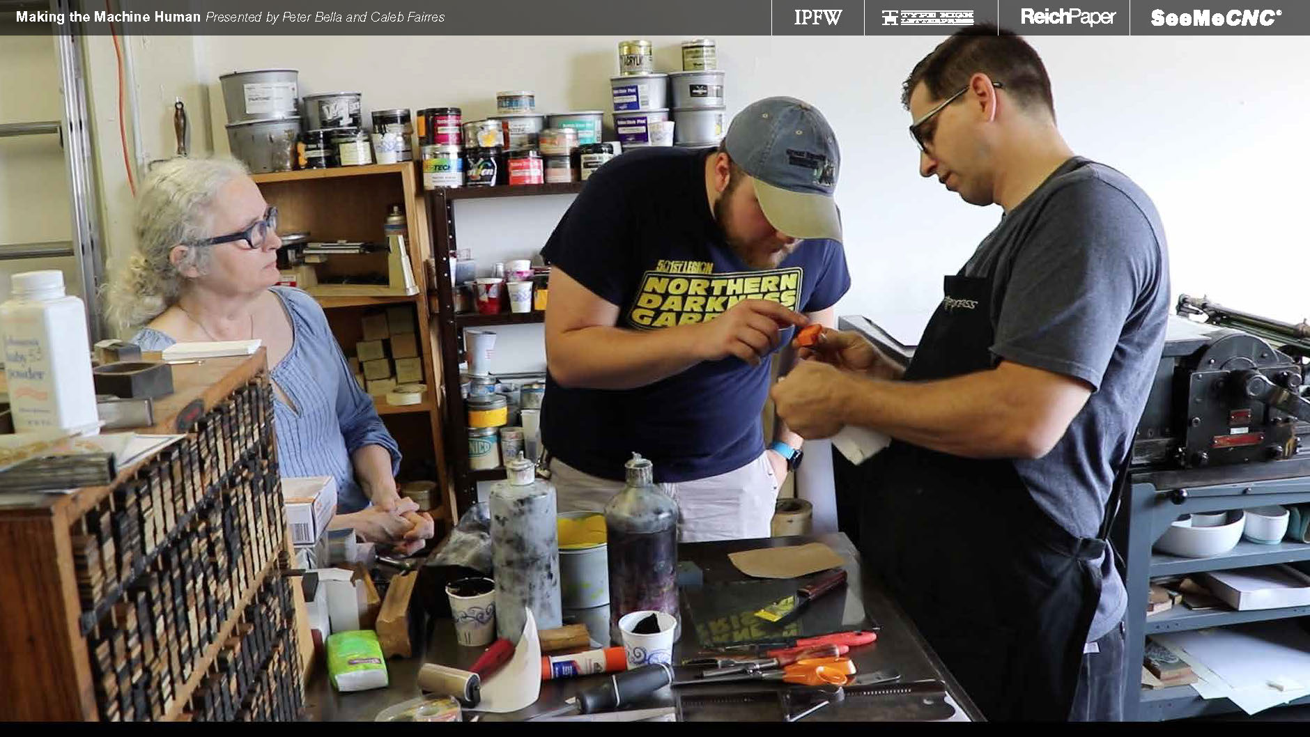
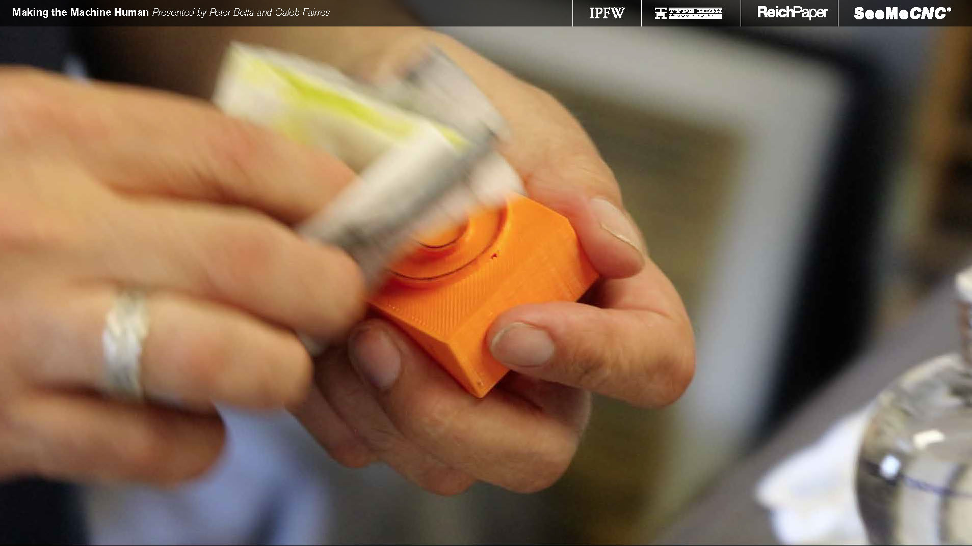
Prints fresh off the bed needed MINOR finishing work done as to minimize damage to the letterpress to practically zero.


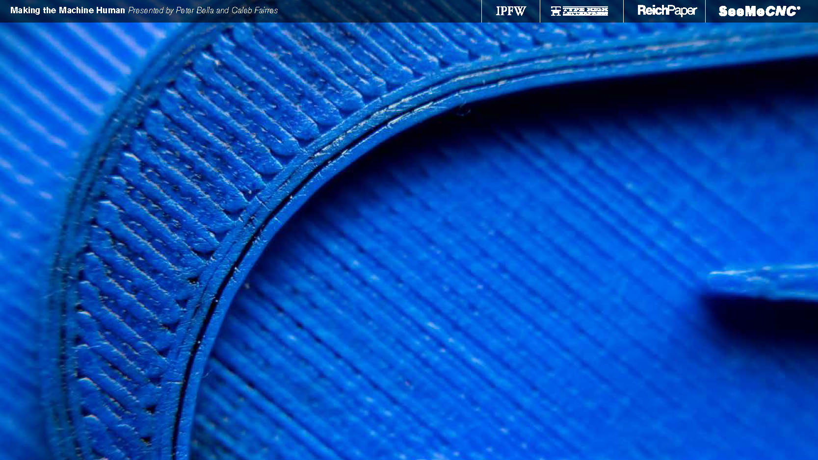
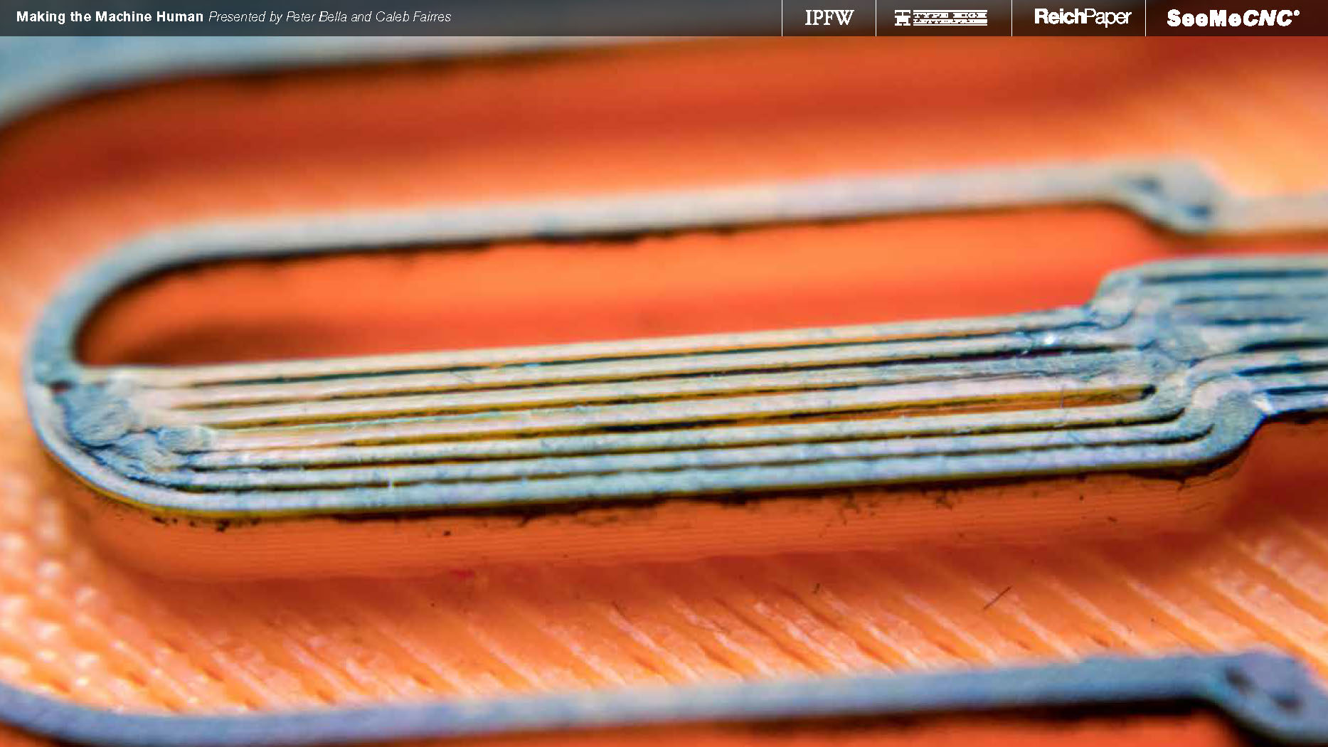
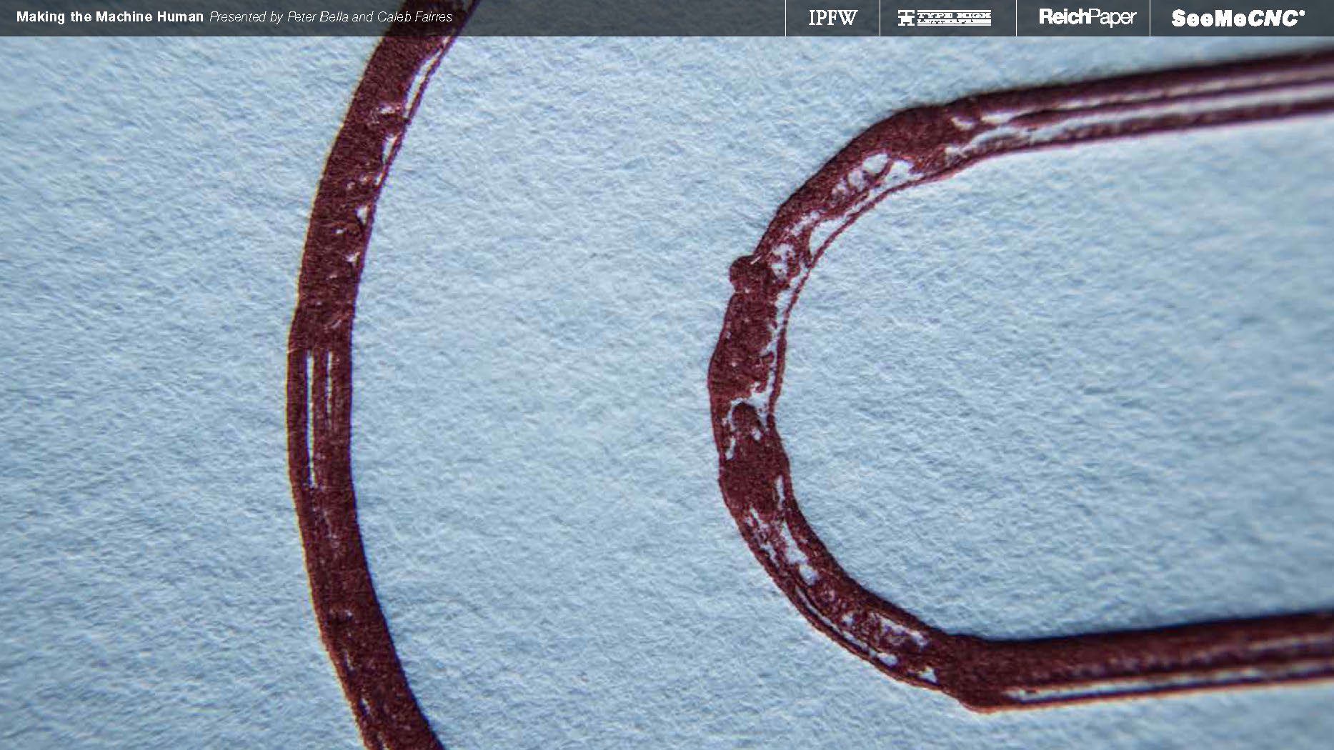
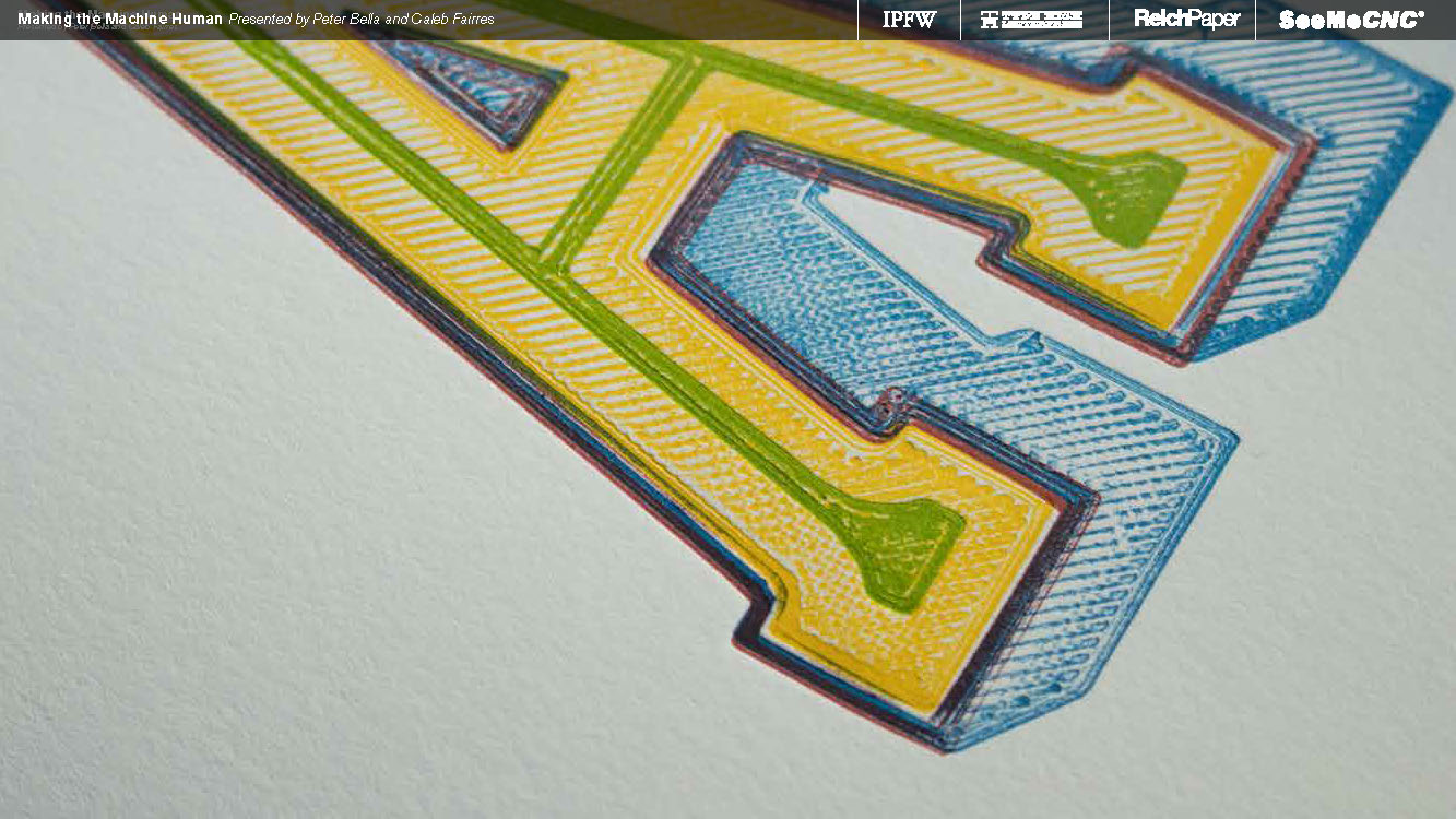
Delicious textures. Mmmmmm....


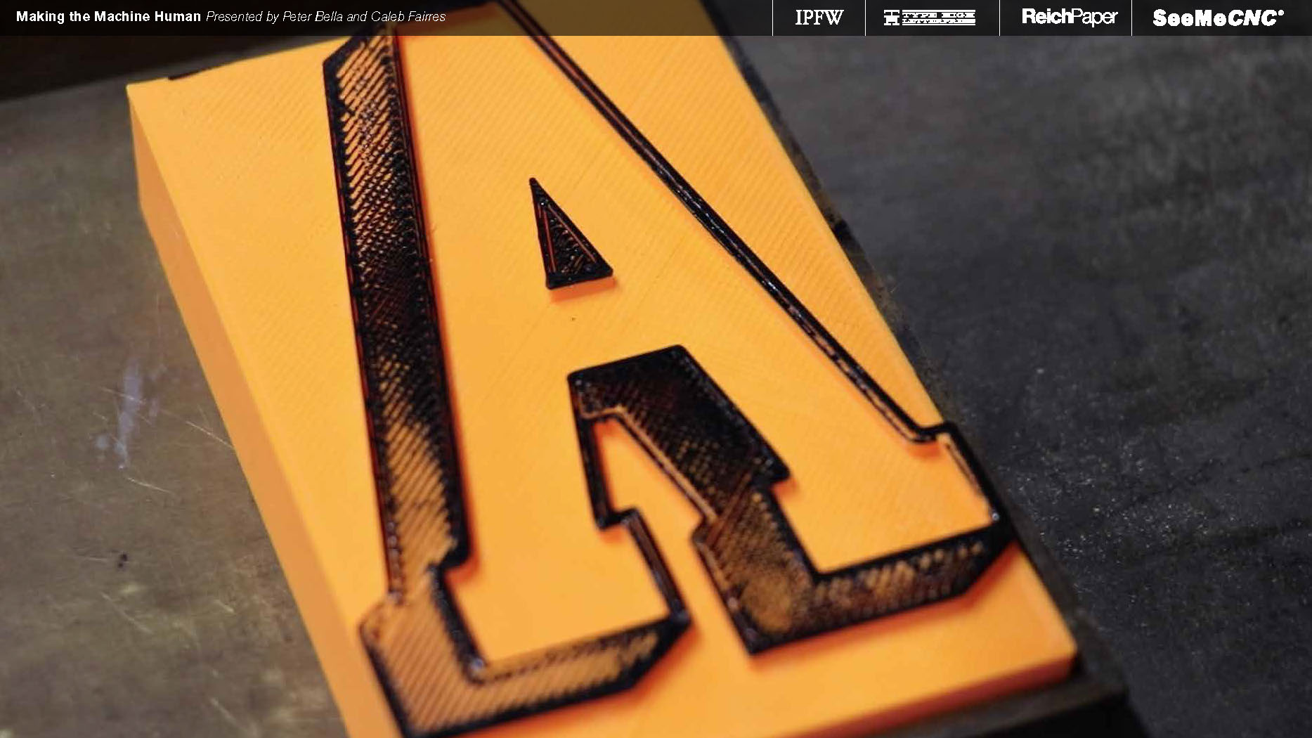
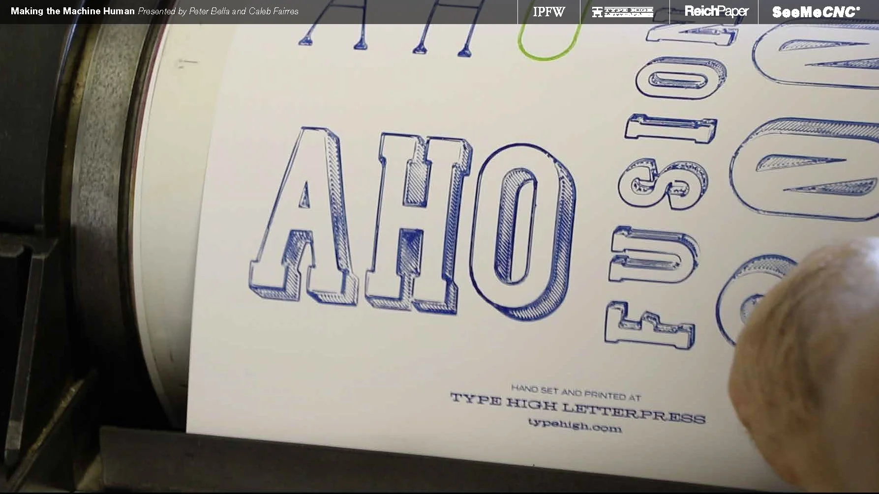
Extra padding was needed for a proper impression.


Mineral spirits are typically used to clean the ink off wood type, but on PLA filament it's a no-no.

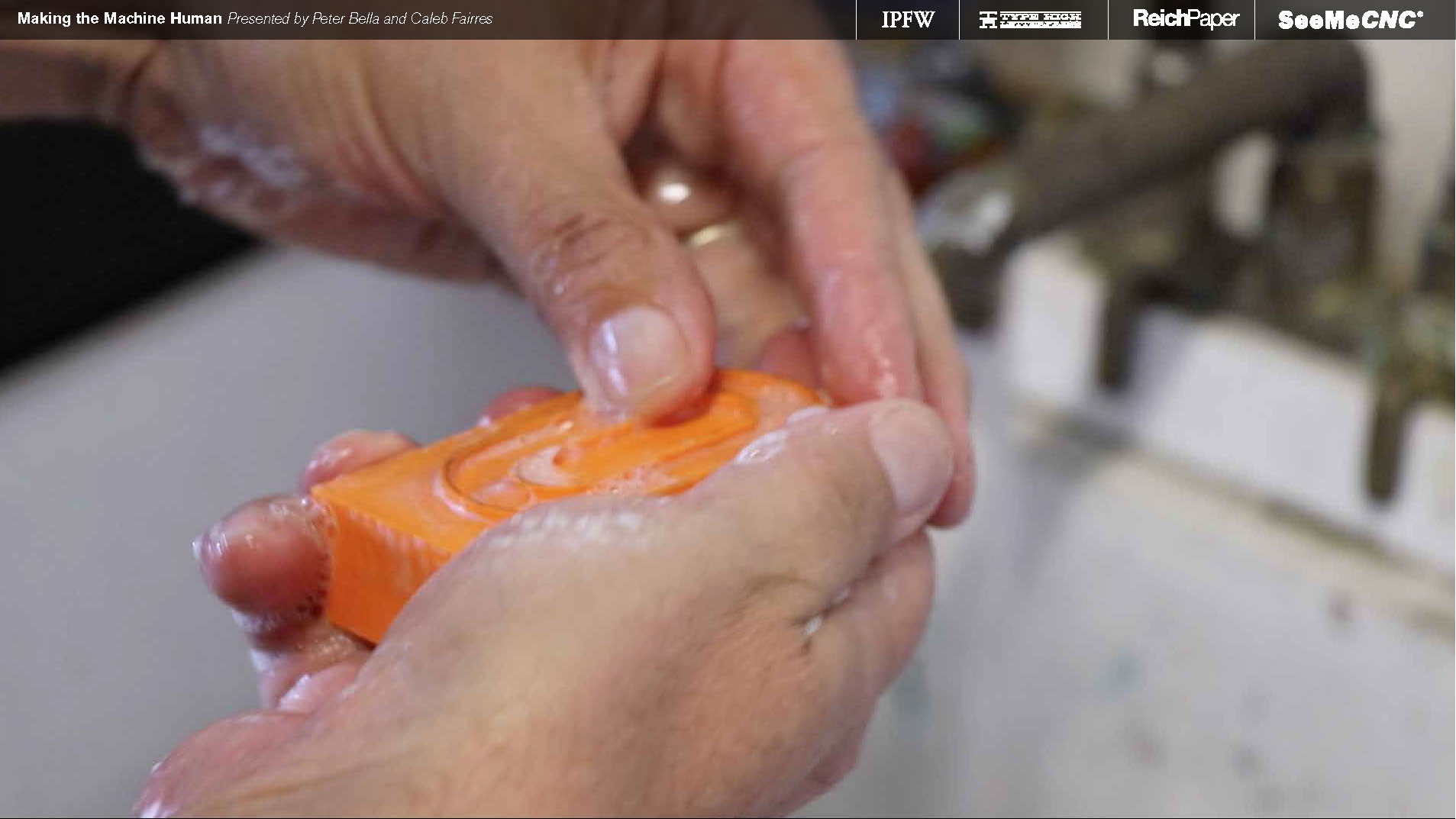
Baby oil and good-old soap n' water is a much less abraisive option with this material.


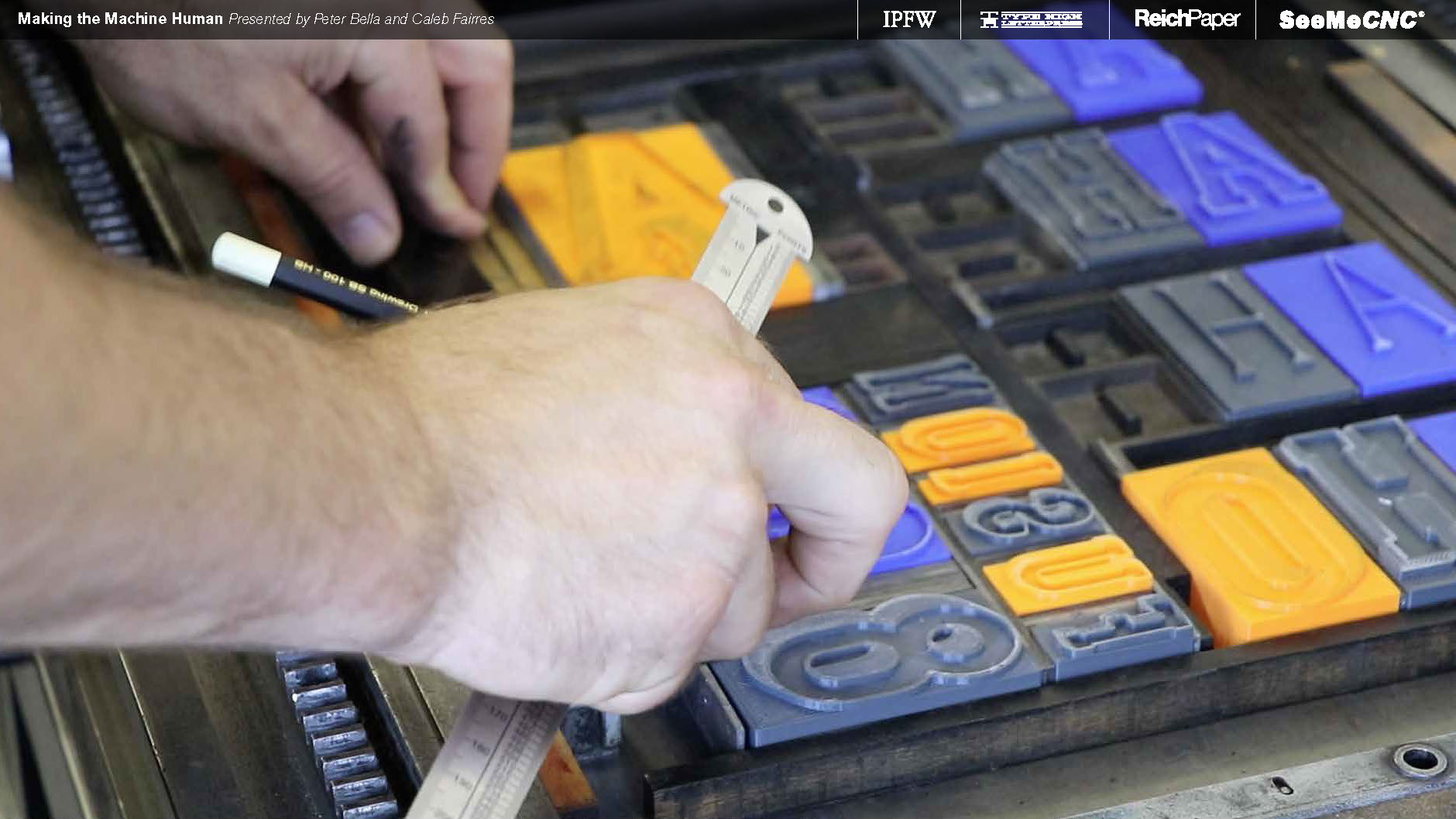
Juxtoposition like a boss.


I'd say that humanistic quality was definitely found within the machine.


Triangle, square, and circle letterforms in alphabetical order. No, I'm not calling you a ho.

Huge shout out to SeeMeCNC, Reich Paper, Type High Letterpress, and the Type High interns for all the hard work and support on this project!
